239 Things

1000 Things is a subjective encyclopedia of inspirational ideas, things, people, and events.

Read the most recent articles, or mail the to contribute.

Studium Generale 1000things lectures, The Hague

239 Things

The Spanish interior architect Iñaki Aliste Lizarrald draws detailed maps of houses from TV series and films.

From Will & Grace to The Big Bang Theory to Up to Breakfast at Tiffany's: fans will instantly recognise the apartments they have so often taken a peek into. Lizarralde (42) meticulously studies the series to find out the precise location of furniture and the way the rooms are connected.

'About five years ago I started to draw the interior of Frasier's apartment,' he writes in an email from Azpeitia, a small town in the Spanish part of the Basque region. 'I liked the series and the apartment, which I wanted to analyse. Then a friend asked me if I could draw a map of Carrie's flat from Sex and the City. That's how this got under way.'

Lizarralde claims he isn’t a complete tube-addict. 'My own taste is somewhat old-fashioned: I like Six Feet Under, Upstairs/Downstairs and Twin Peaks.' However, in order to draw up a map he goes through each and every episode, finger on fast-forward, not to miss a glimpse of the interior.

'Episodes in which the houses are clearly brought into view I study extra carefully. The most important set, usually the living room, features in every episode, so that's easy. But rooms that are more rare to snatch a glimpse of are built anew each time someplace else in the TV studios. Similarly, interiors of houses in films are often hard to reconstruct, because in films they hardly ever show you the whole place.'

Since most series are shot in TV studios, the maps don't show squares or rectangles as in a regular house. 'Films are often shot in closed sets that resemble a normal house. TV series and sitcoms, on the other hand, are made using something like theatre sets,' the interior architect explains. 'The designers use tricks to make them seem bigger. That's why many maps are shaped more or less like a trapeze. Jerry Seinfeld's apartment, for instance, is actually tiny. Yet the angles of the walls are wider than ninety degrees to make space for the actors and the interior. Additionally, these angular rooms make the room look more dynamic.'

Lizzaralde neither tries to make them into normal houses, nor does he strive for a perfect rendition of the sets: 'I translate the aspect of theatre to the realm of architecture, that's where my interest lies.'

Meanwhile, the draughtsman has become unemployed ('for various reasons'), yet he uses his twenty years of experience in interior architecture to make the maps as truthful as possible. 'I know much about measurements and proportions. In the final drawing, everything must be right: the measurements and proportions, the furniture, the colours of the woodwork and even the location of the accessories.'

The final drawings are made with a felt pen, ink and crayon on coarse drawing board. 'I find that this method is peaceful. As an interior architect I used to make digital drawings too, but to these maps I wanted to lend that sense of warmth that only handmade drawings possess.'

It costs Lizarralde around thirty to forty hours to finish a drawing. He sells his work on Etsy.com. Then he copies the whole drawing, which costs him another ten to fifteen hours. And he isn't pricy: they change owners for just forty euros.

The Greek philosopher Anaximander believed the world to be shaped like a barrel and that humans inhabited the flat top. He was the first to draw a map of the world as a flat round button with a border of blue, representing the ocean. Three blue streams of water divided the world into three practically equal portions. The map resembles today’s Mercedes Benz logo. With this mappa mundi, Anaximander consolidated the three known regions of the world at that time: Europe, Asia, and Libya (part of Africa). Those who are familliar with the study of cartography understand the difficulty in drawing up a map based soley on experience.

Take, for instance, the Catalan Atlas, consisting of 8 parts, from 1375. The map follows Marco Polo’s journey and could be compared to a medieval comic strip: a camel drawn caravan rides past castles, cities, through criss crossed routes, two naked men dive for pearls, a servant drives an elephant with the snap of a whip, and text fills the empty spaces. The book, II Millione attempts to provide exact details of his journey but it remains unclear to the geographer how to compile a map using vague descriptions such a day of travel, a day of sailing, or two days walking. The atlas is an amazing visualisation of an unknown world.

Catalan Atlas

For many years, many speculated wildly on the shape of the earth. Flat, round, or oval and shaped like a zeppelin. Mathematicians broke their heads over how an oval shape could be translated to a flat paper. As early as the second century, Ptolomeus folded a sheet of papyrus into a cone, drew all he knew of the Earth, and flattened it. A map. He also introduced the concept of the meridian, lines of latitude and longitude and introduced a catalogue of names of places and their coordinates. He understood that distance and direction were the most vital components to any map.

Catalan Atlas

Artists love maps, their systems, the legend, and the puzzle of depiction. They often make a version of the “real” map to which they can add their own truth. The surrealists were in shock from the horrors of the first world war, and Paul Éluard rearranged the world in a map of the world in which the world’s “pure” cultures were give prominence and some World War I countries were given little to no territory.

The artist Annesas Appel is obesessed with maps and systems. Like the early cartographers, Appel attempts to visualise that which we’re not capable of understanding.

In the View on the World Map 04 (Entities 2013), Appel presents her view on the world in the form of a book. After searching the Internet, she stumbled upon the Bosatlas (the most popular Dutch atlas) on which Europe is centrally placed. We’re so accustomed to this map that we hardly consider the option that this is a choice, one could also use Jerusalem as a map’s central point, like the faithful did. Or Russia. Annesas Appel contextualises herself with the Western tradition in which each individual sees him or herself as the centre of the world.

According to the Bostatlas there are 232 countries. Annesas Appel begins by isolating each country from the grand scheme and proceeds to very carefully draw each province of every country. She then lists each province alphabetically, but leaves out the names of the countries to which they belong. The provinces of Afghanistan, Albania, Algeria, Andorra, and so on, follow one another in a long string, page after page. Appel’s atlas is not a fantastical creation, but a new rendition of the scientific Bostatlas. All is drawn to scale, all must be accurate. The Russian sub-region, Yakoetie, is relatively enormous and, however impractical, its true to life scale is accurate in providing a measure for the rest of the provinces portrayed.

The Netherlands consists of 12 provinces that you think you may know, but once removed from their whole they look like flimsy abstract bits, like little animals or fluffs of moss. American provinces seem like they’ve been drawn with a ruler and the legend shows that the Cook Island provinces are too small to even see.

It would be grand if, like Ptolomeus, the atlas included a register in a long and seductive list of exotic names, like Badakhshan, Badghis, Baghlan, Balkh, Manyan, Daykundi, Farah, Frayab and so forth.

For more, please see: http://www.annesas.nl/

1. Bezuidenhoutseweg. A cold city, that was clear to me even before my train reached the platform. Amsterdam is warm, Groningen is, The Hague isn’t. Amsterdam was my city, or so I thought, the city where my parents squatted in the 1980’s, where Wim Crowel learned his trade. But now I got off at Bezuidenhoutseweg. I could handle a cold city. Leeuwarden is cold, when there’s no one around at 2 AM and the streets are draped in an orange glow. I was introduced to The Hague with the cold somewhere in the background, residing in its parks. Now it slowly encroaches.

2. Herengracht. Everything started to become volatile. Things I had considered good and true for years lost their worth. Whenever I was back in Leeuwarden, the city that I thought was mine seemed alien. Every time I tried to map the changes, they turned out to be bigger than I had thought possible. I was more susceptible to everything - and that’s exactly when I met her.

3. Zuiderstrand. Night, ebb, low plain of wet sand, now and then highlighted in the beam of a lighthouse. This is where we made a pact, our feet in a black North Sea. We stayed till we were numb and walked back past construction works and public buildings with their pilot lights burning.

4. Waldeck Pyrmontkade. Sunday, and The Hague was dormant. On my way to the Museum Quarter, in a daze. This was where the city was warmest, lukewarm, paralysing, a substance in which you could sink away completely and sublimate. Here, she and The Hague became inseparably connected and became my city. Then already I could have anticipated how long it would last. The end felt merciful in a strange way, normalising. I was home for a week and missed the city. When I got back The Hague was, almost in a gothic fashion, mysterious and inviting.

5. Prinsessegracht. She’s here still, but further removed, behind glass panels. It’s autumn now and The Hague is cooling. Everything signals: come closer, sacrifice your previous refuges. This city changes me more quickly than any other place I’ve ever lived and I’m looking for escalation. I want to see this place at its coldest, absolute zero, after that I can handle anything. Yesterday I fell asleep on the train, missed my transfer and washed up on Amsterdam Central Station nauseous and confused. I didn’t recognise that city anymore.

Tags: The Hague

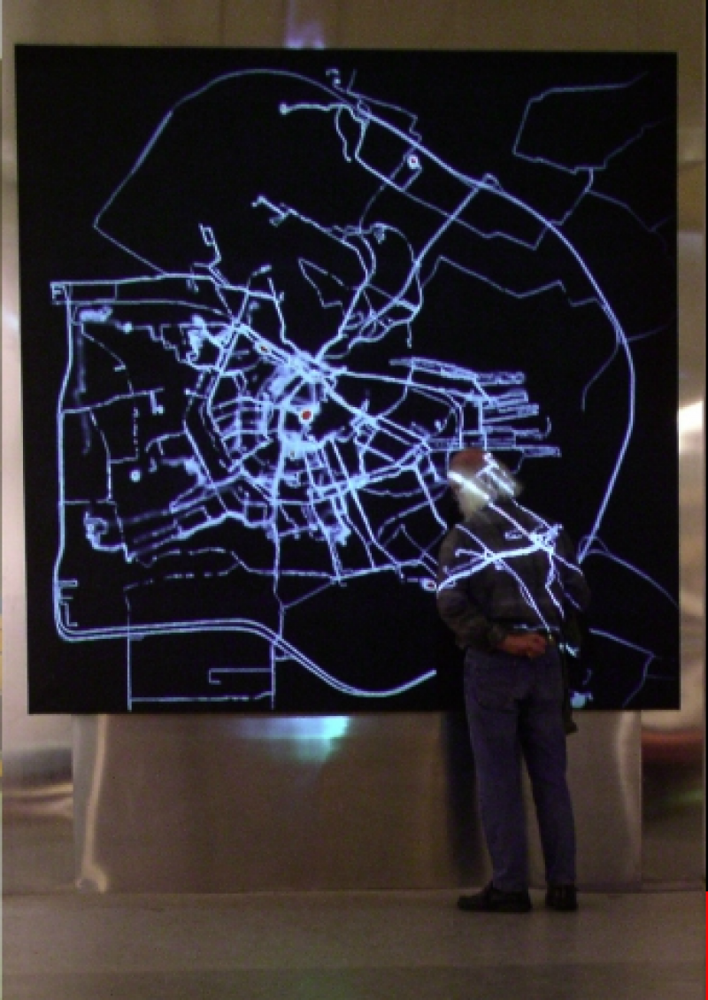
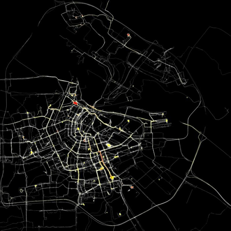
In 2002, I received a New Year’s greeting from the Amsterdam Archive in which they announced a grand exhibition about city maps from across the centuries. I imagined making the most current map of Amsterdam. A living map. Formed by use of the city, using the most modern technology. While traversing the streets, the users of the city would create a trail, as though the streets were formed by the pedestrians the way that roaming cows form paths in the mountains.

Visible trails. This could be made possible by giving a number of pedestrians a GPS system and sending their information to a central computer. This computer would, in real time, sketch their routes on a blank screen. The more movement and the more users, the more visible Amsterdam would become. Different types of users would be appointed different colours, so that one could see the difference in how the automobile driver, cyclist and pedestrian uses the city.

I called the Municipal Archive and spoke with Ludger Smit. He made the great suggestion of attaching equipment to ducks so that canals too would become visualised. I understood that he understood where I was going.

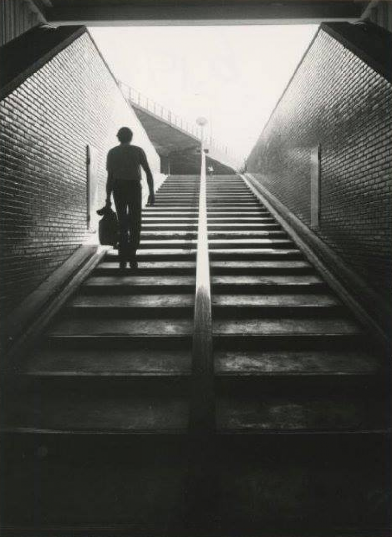
Every Amsterdammer has, as I imagine, an invisible map of the city in their head. The way they move throughout the city and the choices that he makes while doing so are determined by this mental map.

When different users leave their traces in different colours, the viewer will be able to see how individual the map of Amsterdam can be. The favourite routes of a bike courier differ immensely from that of a taxi driver. The mode of transportation, the customer’s request and the person’s mental map will shape the trail that he leaves behind.

Amsterdam REALTIME

The visual result of 75 GPS-tracked volunteers their different routes in Amsterdam

I imagine that trails older than a few days will erase themselves. In this way, a constantly changing, very current, but also extremely subjective map of Amsterdam will be created.

The data will be stored and will result in a film at the end of the project. In the best case scenario, the film will also provide a time frame that will indirectly make visible large events and crowds, like a marathon or a royal wedding.

A completely different option is to use this installation to undermine the power of the cartographer. It would be possible to invite a number of people to use this drawing machine to create their own map. One could use the GPS system to trace the name of their loved one by cycling through certain streets. Another might attempt to draw the official border of the Vondelpark (regardless of having to brave fences and bushes in the process), Another might decide to walk across the same small path hundreds of time, so that it appears on the map as the most important route in the whole of Amsterdam. However, as more people make use of the GPS tracking system, it will start becoming more recognizable as an objective map.

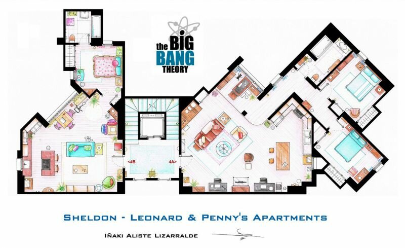
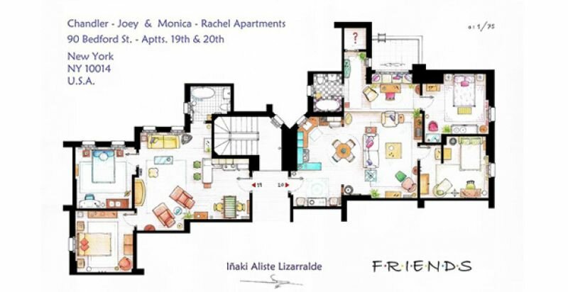
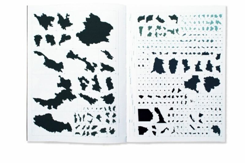
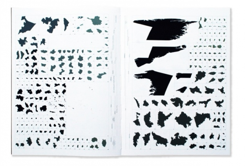
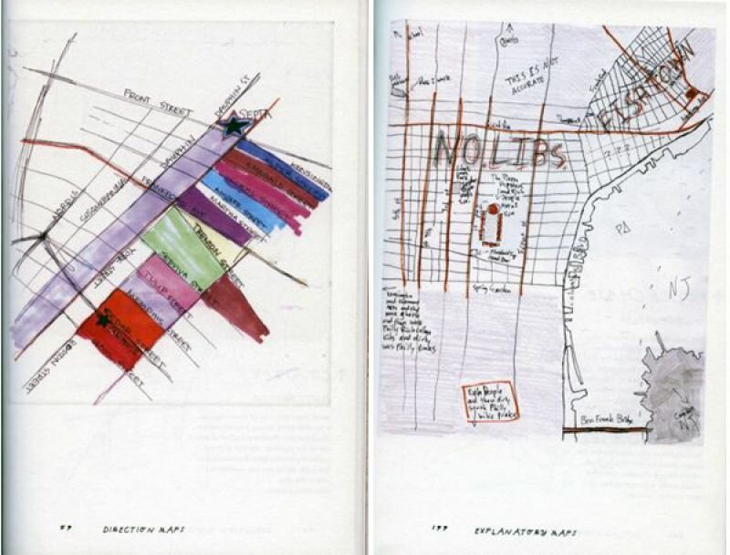
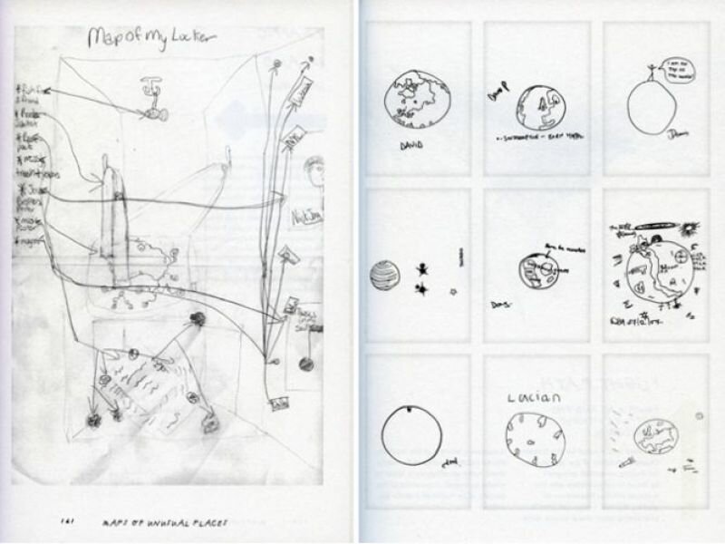
To begin my project, I headed to the Stedelijk Museum’s library to research what other artists have done using maps and charts. What I found most stimulating was a work by Kim Dingle. She had asked teenagers to draw a map of America from their imagination. This resulted in bizarre splotches that she arranged in a rhythmic pattern on a white plane. It looked good as a reproduction. The teenagers were anonymous, yet I could see straight into their minds. It makes one think of the possibility of creating a psychological test based on the analysis of their internal map. You could ask someone: make a realistic map of the terrain that you see as your living environment. A domestic type will draw a map of their house; an adventurous type would draw the whole world. The discrepancies in proportion say a lot about someone’s personality, Reading a palm and reading a map in one.

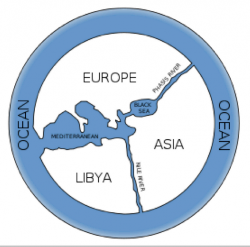
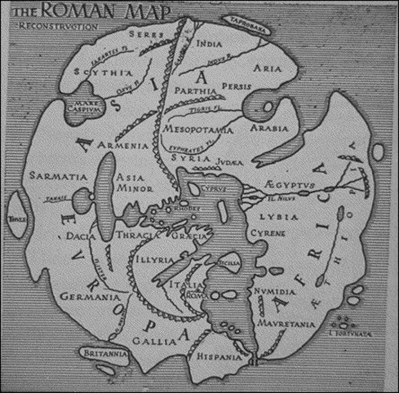
I also found Morit Kung’s book Orbis Terrarum to be fantastic, it contains an extremely rich content. The combination of historical maps and contemporary art is, of course, very relevant to my own projects, and I have to admit that the contemporary works motivate me to study the old maps in more detail. Enjoying these objects is an acquired taste. There are, of course, errors in the maps, but they only make their further accuracy all the more impressive. God knows how they were capable of creating a reasonably accurate depiction of the world back then. Without satellite photos... was this all just done with the aid of a compass and the sun?

Orbis Terrarum - Roman Empire

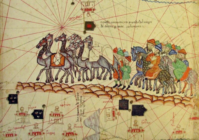
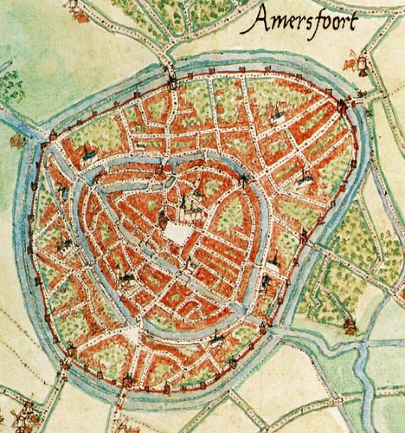
I also attended an event organised by the hiking club Nemo; a lecture by John Eberhardt, head of the publishing company Buijten en Schipperheijn. Eberhardt creates inventories of routes, and so cartography has become his occupation. Cartography is a Dutch invention. A man named Jacob van Deventer was ordered by the king to draw 250 city maps in 30 years by securing a chain between his legs and counting his steps. The maps are still remarkably accurate.

City map of Amersfoort

Made by Jacob van Deventer commissioned by koning Filips II

Eberhardt admitted to mapping stretches of neglected paths as functioning cycle paths, in the hopes that they would end up actually becoming cycle paths. In some cases his plan worked: sometimes so many complaints were issued to the municipality that something really must be done about that bike path. As I heard the cartographer speak about his map, it became apparent that The Map, with its intrinsic air of objectivity and authority, is in fact determined by the subjective choices of the map’s maker and the constraints of technology, time, and money. What I had also never realised is that freedom of press is equally applicable to the publishers of maps. Eberhardt even spoke of the ‘dissident cartographer,’ which I find in itself a beautiful title. The world that is mapped is constantly changing. Each ‘layer’ of the map changes in its own tempo. The difference in the tempo of movement of continents and of migratory birds is immense, and the changes in buildings and plant growth are wedged in between there. His ideal map is one that is in constant movement, which is always changing. My idea of the most current map is very similar. The map itself draws this constant changing of the map.

Reading a map is a form of virtual reality. A model of reality can also change reality (think of the cycle path). By viewing a map through a new perspective, one can discover things that even the cartographer missed. A smart archaeologist, for example, found that all the dolmens of Drenthe are aligned in an exact straight line. The maker of the map had drawn it, but had overlooked it. A map is, then, a reality within itself, where new discoveries are always possible.

A map is also a Utopia. Each map and each user holds his own Utopia. A map for fishermen, hikers, drivers, or geologists each manifests another imagined world. Each map will allow you to enter a landscape with a different experience.

The above idea was executed in 2002 and was one of the first large-scale art projects to use GPS. The project was made into an online version that is still accessible. For more infomation see www.polakvanbekkum.com

There is so much that asks for your attention in the ordinary, everyday life: the shopping lists that have been left in the grocery cart, little papers you find on the street or in the library, notes that have been left in books. I take them with me and collect them for a while, but then I discover a new fascination and the folder with, for example, ‘found items’ is somewhat deserted in my archive. Artists often have better focus and keep collecting to the very end of what might be a beautiful booklet. Artist Kris Harzinski published a paperback titled From Here to There.
handmap spread 1
To prepare his moving to another house, he had started to tidy thoroughly. In one of his stacks of old papers he found a number of maps that people had drawn for him to explain a route or situation. This was the beginning of an archive for maps drawn by hand and the foundation of HDMA, the Hand Drawn Map Association. This collection can be found on www.handmaps.org. A little sketch to show someone the way or to describe a situation mostly shows how incomplete our experience is of the map on which we all move around. During the Venice Biennale I and four others lodged in a wonderful old apartment for a week. On the way back, one of my fellow travelers asked the others to draw a map of it. Which was difficult, for how did that corridor, kitchen and all those rooms fit together again? Five entirely different houses were scribbled onto paper. Giving good directions is often an equally impossible task; you can walk the route without flinching, as if your body intuitively knows the route, but to give a precise description by heart is another matter completely.
handmaps spread 2

Kris Harzinski has collected all these attempts and expanded the series with broader criteria, such as maps that are hand-drawn by artists as official art. The categories are: direction maps, found maps, fictional maps, artful maps, maps of unusual places and explanatory maps. Unusual places contains the drawing by Marilyn Murphy, on which she indicates precisely in which places she is given the injections that are necessary for her arthritis. Harriette Hacker made a map of her face from which all the traces of the past can be read: the chickenpox, the scar from a nasty fall and a single beauty mark.

From Here to There is a beautiful paperback with a small text to accompany each map. However, the small size of the book takes its toll on legibility. Many drawings disappear in the centrefold or are simply too small for all the information. Which is a bit of a shame, because such maps make you want to go through them and sort them out thoroughly.

Everyone can send his or her hand-drawn map to www.handmaps.org.
handmaps spread 3