239 Things

1000 Things is a subjective encyclopedia of inspirational ideas, things, people, and events.

Read the most recent articles, or mail the to contribute.

Studium Generale 1000things lectures, The Hague

239 Things

Brahamans and participants to religious ceremonies. Evang. Broedergemeente - Zeist

Born in Suriname and raised in The Netherlands, Haarnack maintains his collection on the sixth floor of a sleek apartment block in the eastern part of the city, overlooking the area that was once the docklands of this city.

Barber Shop. No. 126 Uitgevers Kersten & Co, Paramaribo

It was here that Nahuel Blaton, my fellow Anthropologist in Art, and I were first exposed to the musty scent of thousands of rare books, common publications and mass-produced postcards; a silent lapidarium of all topics Surinamese.

Paramaribo. A Negro Boy. No. 2 3de Serie,. Uitg. Bromet & Co., Paramaribo

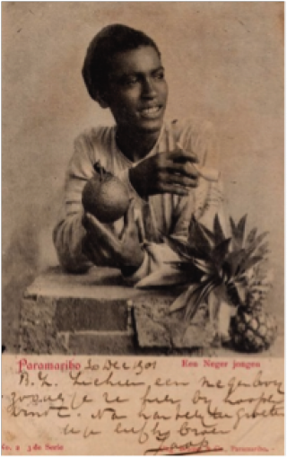
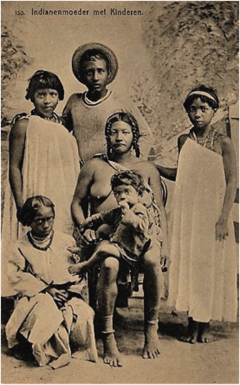
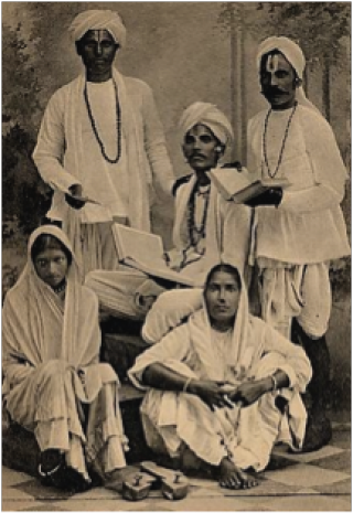
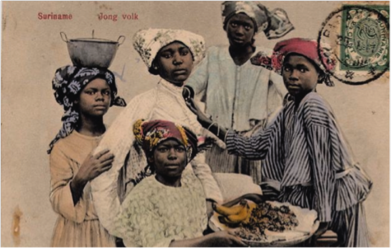
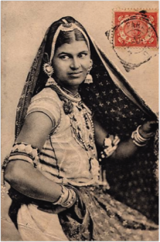
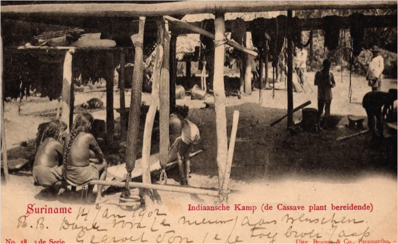
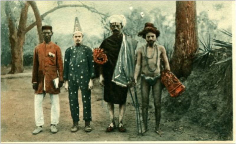
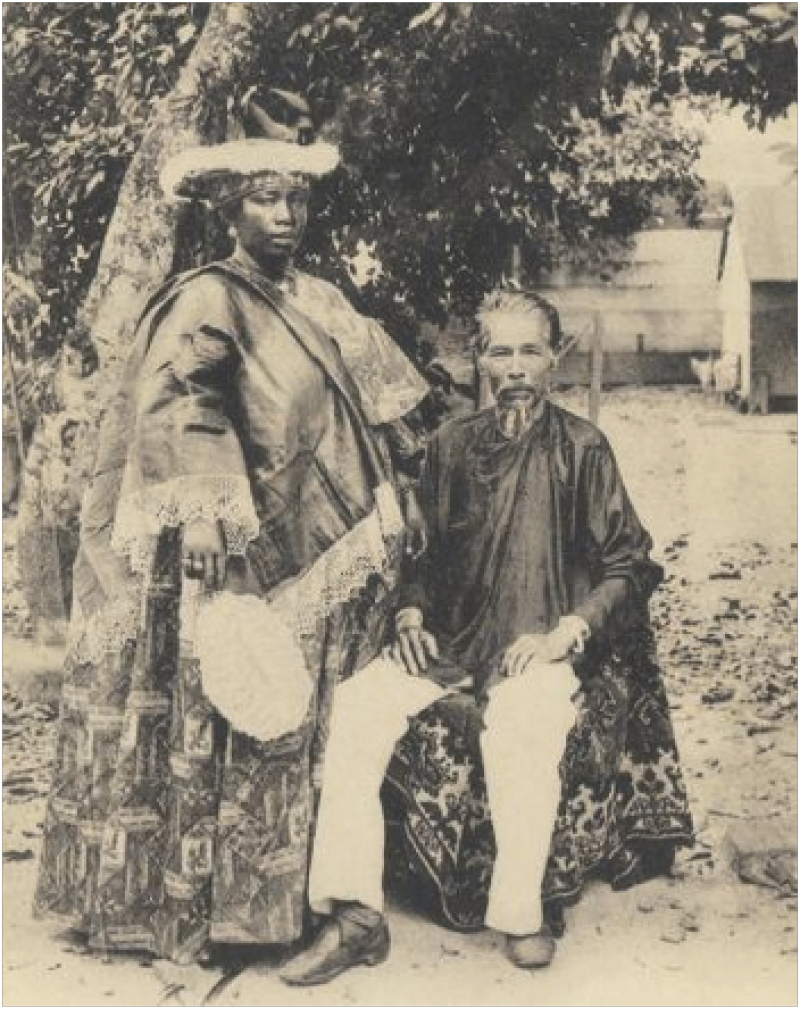
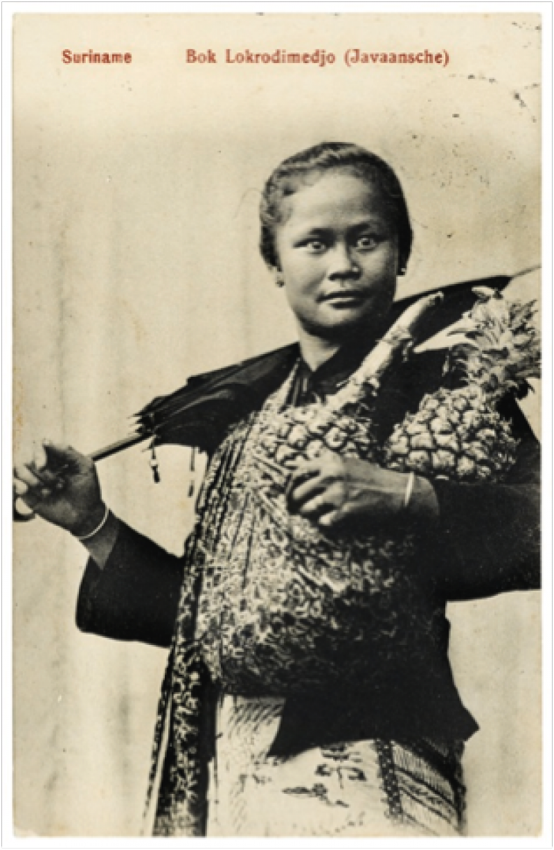
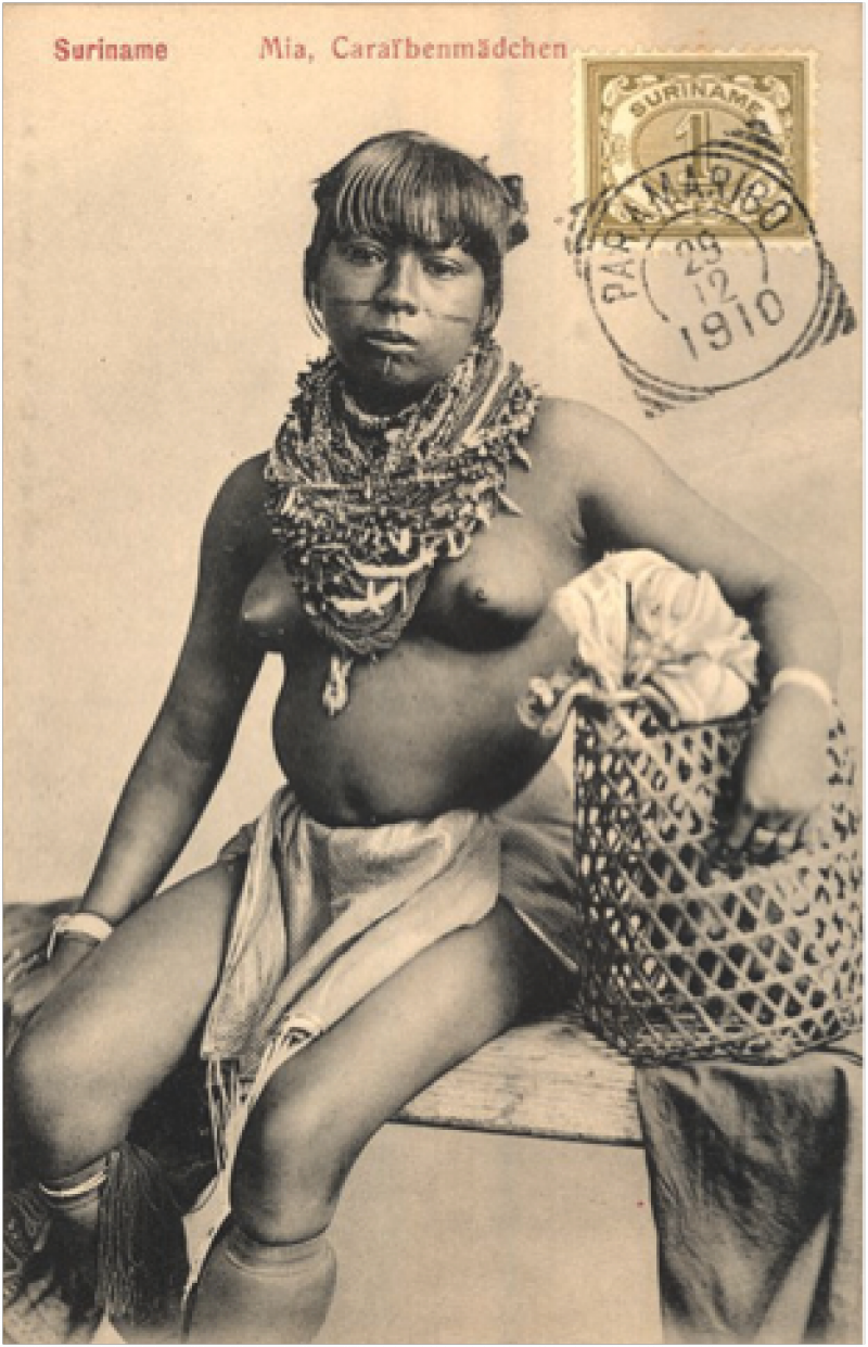
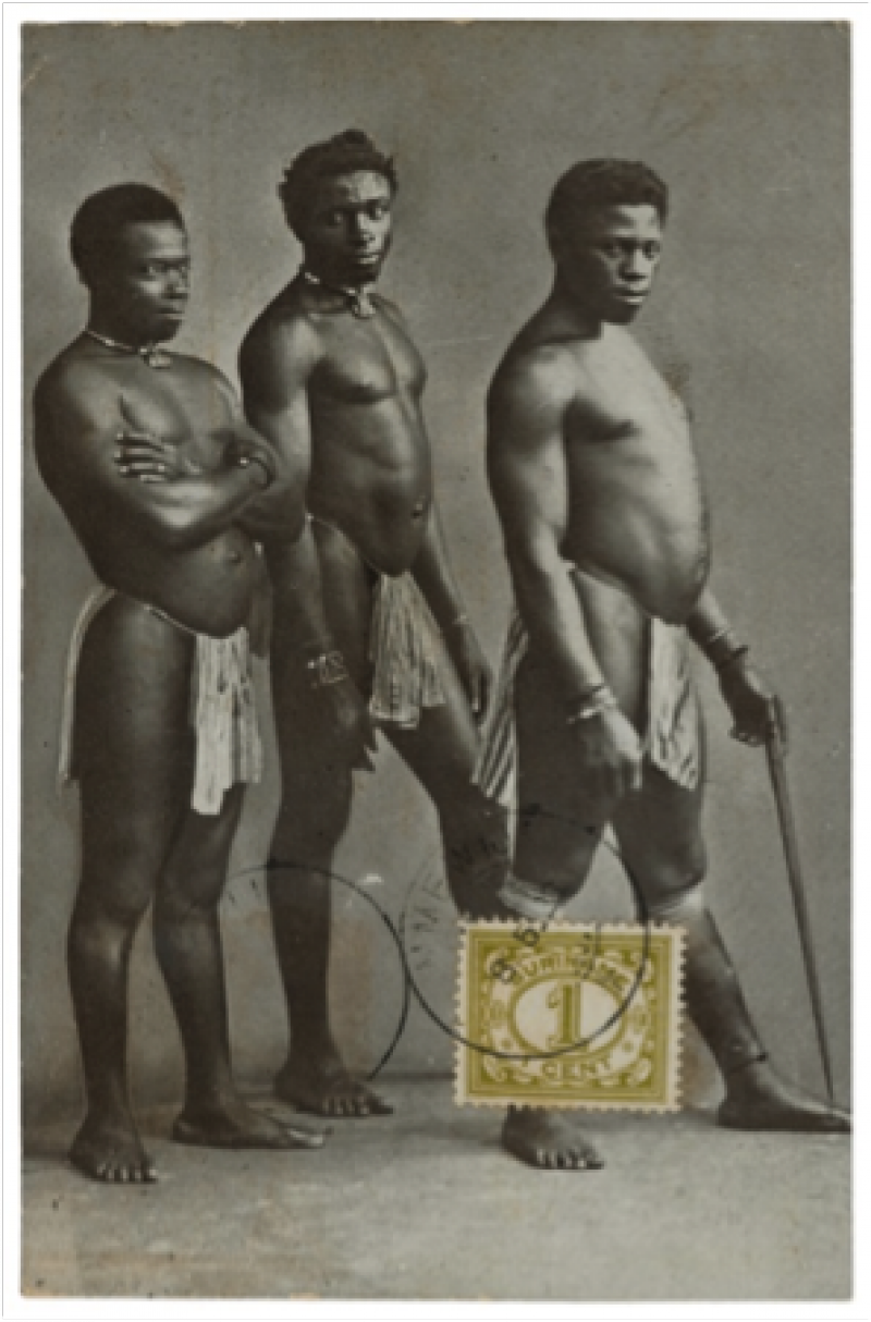
However, when Nahuel Blaton and I first visited Haarnack’s bibliophile’s wet dream, it was the fantastic collection of postcards that caught our eye and inspired the direction of our common exhibition. We flipped through a broad spectrum of photographed subjects; plantation mansions, infrastructure, buildings in Paramaribo, cityscapes, Paramaribo’s harbour, churches, seemingly casual street-scenes as well as exotic fruits and agricultural products. The subjects that particularly made an impression on us however were those of people. More often than not, neatly categorised into ethnic and social groups; one came across various tribes of Amerindians (‘Indianen’ in Dutch), Bushland Creoles (then known as ‘Bosne(e)gers’), City Creoles (‘Stadscre(o)olen’), Indians (known as ‘Britsche Indiërs’, ‘Hindo(e)stanen’ or the rather more politically incorrect term of ‘Koelies’), Javanese and Chinese.

Many of the postcards are attributed to and undersigned by one Eugen Klein. Born in Mannheim in 1869, Klein moved to Suriname in the 1890’s to set up a professional photography studio in Paramaribo. For some 30 years, up until his death in 1927 in Paramaribo, he was the most prolific photographer of all things Surinamese with perhaps his most productive period between 1900 and 1905. After 1927, his widow Louisa Schrader and her children continued running the photographic studio on the Domineestraat C35, at the corner of Vaillants square in Paramaribo, up until the Second World War.

Wealthy British Indians: Uitgevers: C. Kersten & Co. Paramaribo

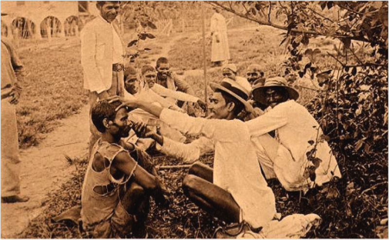
Some of his photographs were commissioned by the primary Evangelical Missionary Society in Suriname; the so-called Hernhutter Mission, named after its first colony, Herrnhut (“unter des Herrn Hut – under the protection of the Lord), located in Saxony, Germany. The Hernhutters had a paradoxical role in the development of Surinamese society. On the one hand, they carried out a doubtlessly benevolent plan of socio-economic advance in the impenetrable interior of Suriname by providing a programme championing education and literacy.

Suriname. Youths. Eigendom Eugen Klein, Paramaribo No. 189 (cancelled 15-12-1911)

On the other, they were also instrumental in the behavioural ‘pacification’ of Suriname’s ‘heathen’ population. This, in the typically religious vein of the period, was coupled with an emphasis on the fight against ‘immoral’ co-habitation, an emphasis on work ethic and a sedentary way of life. Their main business, of course, was that of religious conversion within the various groups of Bushland Creoles and Amerindians. It seems likely that the Hernhutter Mission in Suriname commissioned Klein as part of a political agenda to convince the colonial authorities, as well as benefactors back in Europe, of the success and necessity of their presence.

Raswantia, British Indian in gala. Eigendom van Eugen Klein, Paramaribo No. 175 (cancelled 23-7-1910)

Sifting through literally hundreds of these single or group portraits we realised that what we were looking at was the fragmented imagery of a people before they were to become the nation they are today.

: Suriname.Indian Camp (preparing the Cassave). No. 18 3de Serie. Utg. Bromet & Co. Paramaribo (cancelled 13-1-1902)

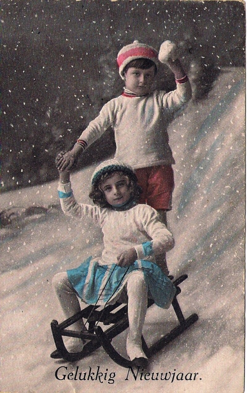
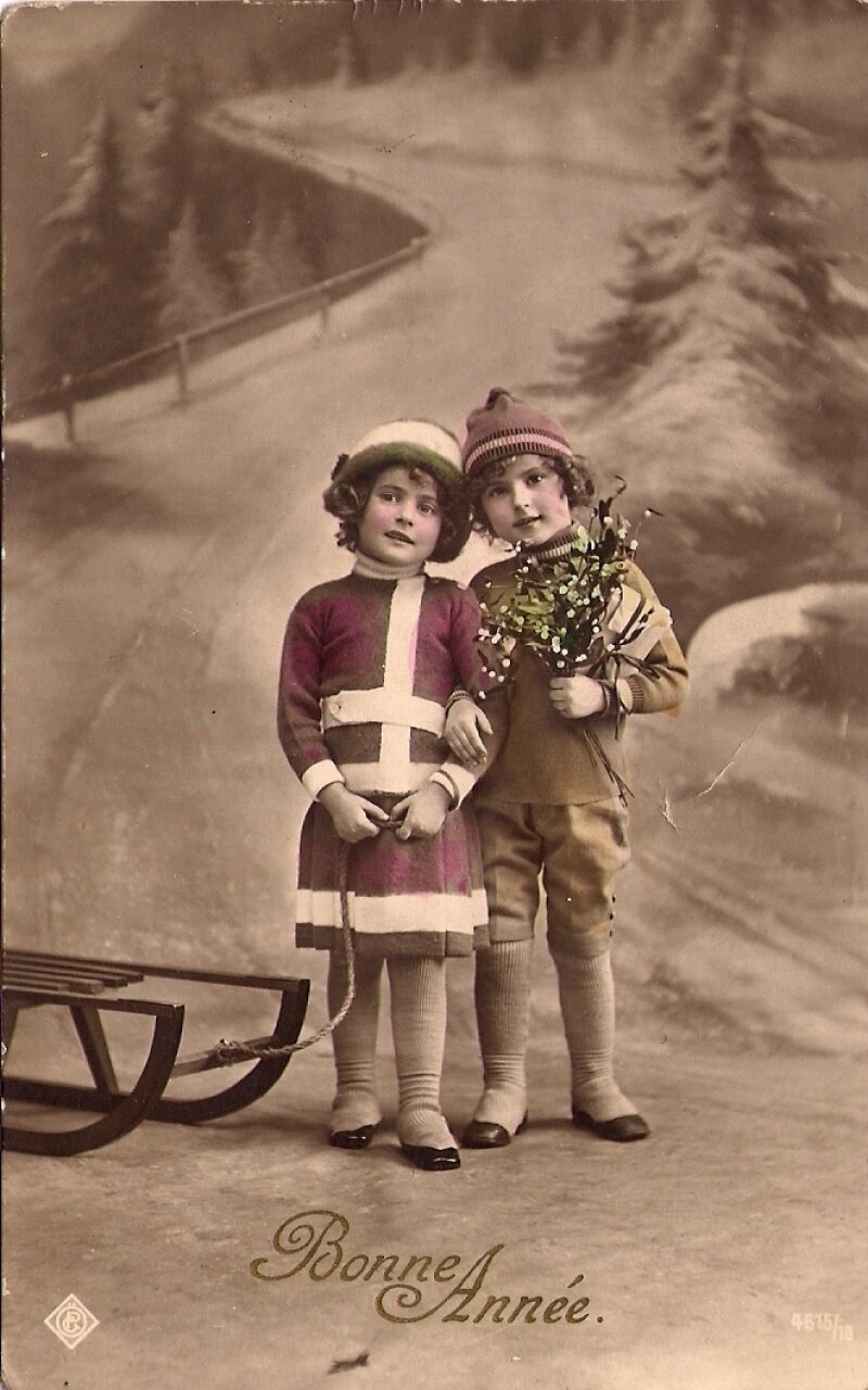
With the introduction of the photographic film in 1871, taking pictures became a relatively easy praxis, even in the tropical climate of this Dutch colonial possession. Coupled with the intensification of economic and political interests that led to an ever-higher frequency of Europeans visiting, working and living in the colony, this would ultimately lead to a veritable boom in the postcard industry. Family and friends back in Europe could now receive visual documents of the exotic far-away where their senders resided and worked. Mass-produced and –circulated, these cardboard-mounted images were intended for consumption by a white, urban bourgeoisie back in the Motherland.

Suriname. Hindu Priests. Uitgave Zendingsgen. der Evang. Broedergemeente – Zeist

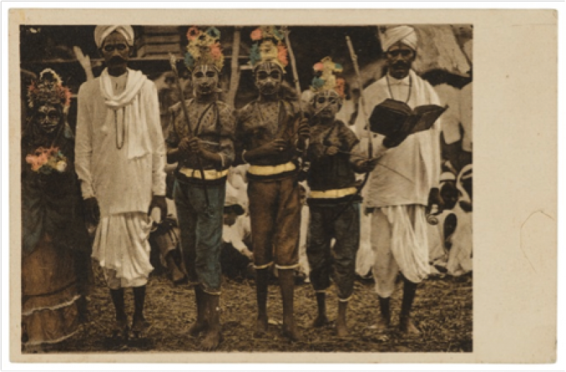
No subject was more popular than that of the exoticised and eroticised peoples that inhabited the distant crown dominions. These, incidentally, are at the same time the most ethically problematic of subjects. For in the practice of photographing these people, one inevitably stumbles across a kind of subjugation, exemplified by both the poses of the subjects, as well as the redundancy of the captions that inscribe them.

“Four generations of Indian women”, “Chinese man with his Creole wife”, “Coolie in Paramaribo”, “Group of Bush Negroes”, “Creole Beauty”, All individuality is negated in these captioned postcards and all individuals are relegated to remain mere examples of their respective ethnic categories.

The backdrops, often with hints of lush verdant foliage, seem to imply an original environment of virgin purity and, implicitly, the primitivism of the ethnic subjects. The artefacts that they wear and grasp – including calabashes, bows, arrows and feathers – are of such formulaic appeal that one would be surprised indeed if these were not staged by the photographer.

Bok Lokrodimedjo (from Java). Eigendom Eugen Klein, Paramaribo No. 185

The strength of these postcards may lie in the sense of estrangement that his portraits evoke. A sense of estrangement that lies somewhere in between the distinct past that the images evoke, with the paradoxical realisation, that this distant past is, in fact, uncomfortably near. These visual documents of bewildering clarity and from a not-so-distant past attest to the photographic praxis of production, circulation and consumption that rendered huge segments of the global population into mere objectified ethnographic exhibits.

In the context of our contemporary, politically correct society of polite moral indignation for a past that is, quite frankly, our legacy, these photographic proofs disturb and embarrass us, and rightly so. We continue to deal with the vestiges of this uncomfortable past in public discourse and the individual level even today. Moreover, lest we let our guard down, we might still be judged as complicit in the consumption of imagery that underlie global politics of exploitation and subjugation by future generations.
Suriname. Three sturdy boys! Typen uit het Boschland. Uitgevers: C. Kersten & Co. Paramaribo (cancelled 8-5-1928)

So, let us be thankful that amongst us, there exist those individuals and institutions that are dedicated to the preservation of material from former colonies, different mores and bygone times. I invite all to subscribe to Buku’s blog on books and other ecclectica. Mr Haarnack’s enthusiasm for all matter Surinamese and published will prove to be as infectious as it is to us, Anthropologists in Art.

Visit: www.buku.nl

Zwart licht, 1984

Zwart licht, 1984

Art Unlimited made a postcard out of “Nightlight” that sold well. Philips had objected greatly and made many attempts to take the postcard off the market. The following correspondence between lawyers covers the, lawful or not, use of cliché.

Mr. M.J.M. van Kaam, Letter to Mr. PR.M. van de Kroft

Philips International B.V. Corporate Patterns and Trademarks Eindhoven
14.10.1987us
Subject: Philips shield emblem

Dear Mr. van der Kroft,
(...) Regarding the Philips shield emblem, Philips possesses two trademarks registered within the Benelux. (...) The said trademarks both include, among others, class 16 to where the postcards in question belong. On the basis arising from the rights of the above mentioned trademark, which derive from 1938, and on account of the Philips brand’s great worldwide reputation and renown, we are of the opinion that Philips can, within right and reason, oppose your client’s use of the Philips shield emblem.
In this case, we have established that your client, without the permission of Philips, is selling postcards depicting the Philips shield emblem and is thus profiting from the appeal of this brand. Therefore, your client is making use of the Philips shield emblem for promotion of his own merchandise in addition to the sale of this merchandise (...). Furthermore, we must reject your view that, besides for scientific and informative use, artistic use is an additional legitimate use…
On the grounds of the above, we believe that your client must cease the offending use of the Philips shield emblem. Moreover, we trust that you will understand our position. A firm such as Philips should at all times prevent its brands from possible damage to their primary function as distinguishing feature.

Mr. PR.M, van der Kroft, Letter to Mr. M.J.M. van Kaam, 23.10.1987

(...) Of course, my client understands that Philips, in principle, takes action against each use they deem infringement of trademark. The question that divides us is whether this is, concerning this case, justified (...)
I am aware that Philips produces and distributes a multiple of goods within the Benelux. However, I am unaware of Philips manufacturing and distributing printed matter, in particular, postcards. For this reason, I must rely on non-usus in the merchandise concerned. In my opinion, my client is not using the brand to promote her business nor the sales of her own merchandise. (...)
In regards to neutral and non-offensive use of the Philips emblem, I would like to compare the postcard with the use of the image or word Philips within a literary publication, against which action would neither be taken, so long as this occurs in a non-offensive manner.
How interesting this question may be theoretically – and I remain curious of your opinion concerning aforementioned, I consider it wiser to choose a practical solution. From my client, I have understood the edition to be very limited. I will request from her a proposal, which I hope to promptly present to you.

Mr.P.R.M. van de Kroft, letter to Art Unlimited, 23.10.1987

(...) I hope to somewhat stretch the discussion, until your edition has been sold out. Could you give me an indication of how long this might last? After this, we’ll dutifully promise Mr. van Kaam that we won’t print any new editions, on the premise that the artist will be allowed to exhibit the work freely and include it in exhibition catalogues.

I have an early childhood memory of receiving a postcard from my neighbours who were on vacation in Limburg. On the left part of the card “KR Brinkman Fam.” was written. I wondered with surprise why they’d only leave an abbreviation when there was still so much white space left on the card. Despite that enormous vaccuum, I remember my mother being very pleased with this postal greeting.

This is the essence of a postcard; it’s a gesture of presence. The postcard can contain a message that's nearly empty, that does little more than communicate the sender’s message: “I’m here” or “I’m thinking of you”.

Since college, I’ve been steadily building my collection of postcards. All in all, I have around three shoeboxes full of them. There’s no real underlying theme. There are the prototypical “happy birthday” cards. On one of these cards, meant for a man’s birthday, is printed a shaving brush, a beer jug, cigars, a miniature car, and a slightly pathetic bouquet. One birthday card for a woman shows a cyclamen, a mixer, a candleholder, a sewing machine, and other assorted household appliances. These are still lifes from the fifties that are becoming increasingly rare.

I have Turkish and Italian cards, countless art cards from the Kröller-Müller, the Prado, and other museums. Since 1993, “Free Boomerang cards” came out on the market. These cards were freely available to be plucked from display stands at cafes. There are some very strong ones among these. For example, one printed with the expression “In a dip?” shows a depressed teenager on a white folding chair in his empty study room. Or a card with a man falling from the skies with the words, “Ever considered aerotherapy?” Boomerang seemed to have a card designed for every idea or mood.

I often look through a pile of cards if I want to change my mood or my mode of thinking. My unwritten postcards are not addressed to anyone, and don’t need to ever be sent to anyone. They are images and ideas in their own right.

The philosopher Jacques Derrida takes this a step further in his book, La Carte Postale: De Socrate à Freud et au-delà [1]. In the Bodleian library in Oxford, he found a postcard on which Plato and Socrates are depicted. This card fascinated him, because neither the meaning of the card, the image, nor the text on the back correspond to its message. It is a gesture, an impulse, a transmission, or “un envoi,” in French. It takes flight and in that, finds its power. Every letter has certain content; the postcard has no need for that.

Derrida claims that a philosophical text is like a postcard. Plato’s dialogues, in which Socrates is always the main character, are some of the most well known texts in the history of philosophy. According to Derrida, they can be seen as a series of postcards that have been sent into history. Derrida wonders how Freud received Plato’s postcards 2500 years later.

There are certain postcards that I would never do away with. An aquarelle in card form by Marlene Dumas from 1989 titled, “On his back”, for example. I bought this card after seeing Dumas’ exhibition at the Centre Pompidou in Paris at the end of 2001. Each time I looked at it, I became calm, as though my son, one year old at the time, was depicted on the card. I’ll always cherish this card for the therapeutic value it had for me.

Choosing a Dumas-in-card-form is no coincidence: she has often told that her work is often based on photographs and images. She sees the interpretion of images towards an intrinsic meaning as a process in which the different elements overlap.

To observe and to give meaning; we cannot help but bring what we see into words. Dumas puts this very succinctly in an interview: “words and images drink from the same cup, and our ears are next to our eyes”. [2]

Apparently, the poet Rutger Kopland has a huge collection of postcards. Among his writings, there are various poems dedicated to musing upon these cards.This one is titled “Choosing a postcard”. [3]:

Choosing a postcard

On the postcard there are a couple of men
playing pétanque below a plane-tree
at their feet the balls they’ve thrown
they’ve stopped the game and ponder
they are standing in a circle, heads bowed
over what is lying there
there’s a problem lying there
never have their balls lain like this
I could keep looking at this card
it’s probably almost night there now, the shadows
have lengthened, the end of a hot day
and while nothing moves there
invisibly slowly a question is growing
the question: what now
I’d really like to send you this card

© Rutger Kopland

© Tranlation: Willem Groenewegen http://www.decontrabas.com/de_contrabas/2009/08/rutger-kopland-75.html

James, Jennifer en Georgina, the book

photo Joris Landman

James, Jennifer en Georgina, the book

photo Joris Landman

James, Jennifer en Georgina, the book

photo Joris Landman

James, Jennifer en Georgina, the book

photo Joris Landman

The mother takes father on a trip. Their daughter Georgina stays behind with the nannies that are going to take care of her. The mother sends her daughter a postcard every day.

'It's proof of her love and her absence. 'And every day we were apart wrote to her.' (The mother)
'I have come back to the family.' (The father.)
'The drinking stopped and so did the postcards.' (The daughter.)

210 of the 1136 post cards were selected and printed in a thick book, the front and backsides matching and the written messages on the cards printed in block letters so that they're easier to read. A bright yellow, sun yellow book, thicker than a phone book, so thick the spine needs three folds to properly open. The book tells their story. The Beginning. This time over, James and Jennifer wanted to stay together.

Even when Georgina was born and the father kept on drinking heavily. The doctor warned him that he wouldn't have much more than two years left if he stuck to his drinking habits. Rehab didn't help. Jennifer discovered James hardly drank when they were travelling and decided to take as many trips together as possible, in an attempt 'to dry him out'.

The first trip begins October 25, 1989 and the card reads: 'Qui (we) love you more than Paris.' Georgina is 79 days old by then. On August 8, 1990, a day after Georgina's birthday, Jennifer writes: 'Over the Atlantic Ocean en route to Boston. My darling 1 year 1 day. The dots at the side the stamp are the spots of color used. I do wonder if you will like stamps. Mentioning dots reminds me of kites which are dots in the sky; a tug-of-war with the wind. Love Mumm.'

November 16 marks the last post card of that year, which means the family will spend Christmas and New Year's together. Thank God!

August 7, 1991: ‘We’re here and you’re there which is a terrible situation on the occasion. We have spent the day with Jill and that was jolly good. We laughed because we were with you on the 21st! These fellows threw the British out in 1775 just before the Boston Teaparty. Not like your birthday, a bit rougher. Love Dad and Mumm.’ The card has a picture of the statue of The Minute Man, lead gray against a bright blue sky.

How strange it feels to read the father's vile words towards the mother during this anti-alcohol journey: 'Mumm has swallowed so many pills that she rattles when she walks.' Other than that there are messages about the different kinds of champagnes, descriptions of celebrating Left Hand Day in the US, delays and bad behaviour, and on March 17 there is a little drawing of a hunting daddy: 'We are very sad that you have measles and a high fever - all these awful childhood diseases one has to muddle through in growing up. The good news is that the tiles were laid today in your bedroom and the bath is in situ in your bathroom.'

Later: Daddy has been brilliant. His French is so good the natives want to claim him.' And later this lamentation: 'To be queen and live with such paintings.'

Except for a few, the cards aren't made for children, there is a lot of art, monuments, cities and landscapes. A sneak peek at the world. 'Hair. My hair - masses of it - is an expensive, time consuming nightmare. Cauchemar. Every three weeks colour. Every months straitening. Every week ironing.’

Some of the cards are made by hand and every stamp is picked with care, just like every written word has been carefully chosen. But it's not just the post cards that tell the story; just like every movie on DVD, it comes with extras.

The family turns itself inside out, like turning a piece of clothing and exposing all the seams, stitching and lining. What's this family doing to themselves? Each of three main characters shares stories throughout the book, there is a small photo album and there are the 'Conversations':

21 conversations they had, printed without any censorship. I imagine a shockingly honest AA-meeting and this time I get to participate from the sideline, I get to read whatever happens.

‘I don’t remember you and Dad at all before seven. Zilch (nothing). If we have 1200 postcards and some days there were three in one day, that’s a lot of years. And that’s being kind,’ the daughter says.

During ten years, 1136 cards were written. The daughter was left alone for about a third of the time. Jennifer kept all of the post cards: 205 flights, 268.162 miles in the car, two bull fights, one speeding ticket, 53 unpaid parking tickets, 13 cancelled flights, one bomb alert, 205 church visits, wars, inflating prices, births, funerals, holidays and so on.

Georgina remains mild and laconic about her childhood. At first the reader is confronted with a stinging kind of truth and the uncomfortable feeling that comes with it, but there's a sense of admiration at the same time. Georgina: ‘It’s been a much more honest family environment because you have never been dishonest with me. Dad doesn’t really say much so there’s no dishonesty there. [An ironic laugh] Yeah, I think a lot of families tried to hide things for so long – suddenly the truth comes out and all hell breaks loose. Our truth would come out and it would create very unpleasant moments, but it would only last a day or two days instead of three years because everything was hidden for so long. Life has been brutally honest from when I was young. That could have been good or bad but I think it’s turned out to be very good.’
 And there are those truths every parents tells their children now and then, knowing the child will forgot about them is as soon as he or she turns around the corner. Parents try to calm themselves.

Daughter Georgina says in 'Conversations': On the other side was the lesson of the day: don’t ever be dependant financially. Rely on yourself first. Don’t marry a man with crummy shoes. A woman must never seem in a hurry.’

Jennifer made the book for Georgina's 21st birthday, but also for herself, as a kind of reassurance and oath at the same time. The book is dedicated to the eight children that came from their earlier marriages. Every decision regarding the book is based on the number 3, the price is 999 € and it's printed in an edition of 999 copies.

The immaculate design is done by Irma Boom. And no matter what you may think as an outsider, Georgina speaks very lovingly when it comes to her parents. ‘Even though my mother was absent, she immortalized every day she was gone. She endowed me with her ability to observe, give detail and discover a good story, and gave me a love for history and perhaps unconsciously, for Russia.’
‘The book is yellow because it’s full of light and success!’ Jennifer says in an interview.

http://jamesjennifergeorgina.com