
Artist Mirthe Kluck (1991, NL) lives and works in The Hague, The Netherlands.
1000 Things is a subjective encyclopedia of inspirational ideas, things, people, and events.
Read the most recent articles, or mail the to contribute.
Artist Mirthe Kluck (1991, NL) lives and works in The Hague, The Netherlands.

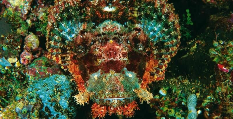
Camouflage is a weapon that tricks the eyes of the opponent. Though it seems innocent, a life may depend on such visual deception. By way of a specific application of colour, patterning and shape, an animal or object merges into the background and/or is harder to recognise. This is of significance to both prey and predator, the latter of which is able in this way to sneak up to its target without being noticed.

Humans, however, have to get by with the colours of their bodies; fortunately they wield the human brain for a weapon, with its vast range of applications. This age-old technique of Mother Nature, the art of camouflage, was copied early on by monochrome men. Vegetius, in the 4th century A.C., mentions that the Romans painted their boats and the crew’s outfits venetian blue in order to blend into the background. The blue of this pigment matched the dark deep blue of the ocean they crossed to make for England, as ordered by Julius Ceasar.

During World War I, polychrome camouflage was applied at a large scale for the first time. In 1915 the French started to exuberantly paint their gear and armed vehicles. Up to then these had muddy colours to not stand out; now they were given separate colour fields according to the technique of shape-blurring colouring.

The first camouflage painters were members of postimpressionist and fauvist (less dots, more fields) schools in France. Later, modernist movements such as cubism had an impact on camouflaging armies, since they were knowledgeable of distored contours, colour theory and abstraction. In France one went as far as to found an official ‘Section de Camouflage’ in which painters worked. If you might have the idea that art does not dwell in times of war- well, it seems that art and war sometimes get along frightfully well. During the end of World War I thousands of ‘camoufleurs’ were employed in studios around Paris and thousands more at the front.

Cubism reached the flourishing peak of its military application when the cubists were commissioned to paint British and American ships. Neither the venetian blue the Romans used nor several other pigments appeared fit for the task of rendering the ships virtually invisible through the fluctuating weather conditions. Oddly enough, the colours needed to camouflage the ships were not to be found in the grey/blue spectrum, but in sharply contrasting colours such as white, black, blue, red etc.

Norman Wilkinson, a British marine officer and painter, conceived of painting the ship in geometrical fields with these colours, in such a way that the blurred shape of the ship would make it hard to gauge for the enemy, who would be blinded by the colours and miss when firing his torpedo. The effect of this paintjob was so significant that it became almost impossible to estimate the direction of the ‘razzle-dazzle’ ship. At the end of the war, no more ships were painted in this way. The aesthetics of the ships no longer fit with the military spirit and made ships visible for airplanes.

Colour has had a major effect on the evolution of life on earth. For many animals, the colours adorning its body became integral to survival by becoming tools of camouflage or intimidation. And for many animals, including humans, the ability to see in three colours proved to be very helpful when finding food.
After humans developed tri-vision and they discovered that pigments left residues on surfaces, a need for better pigments arose from which they could make paint. Colour then secured a fundamental place in the life of the human.
Brilliant colours were seldom seen in the pre-modern world.Anyone walking into a supermarket, looking at a colour television, or even looking at a box of pencils will see a greater number of hues in an instant than most pre-modern humans saw during their entire life. It’s for this reason that before the industrial revolution, rare hues not only exuded a great force of attraction, but was also laden with enormous symbolic meaning. All over the world, civilisations made use of conceptual colour codes to attribute status to objects persons, or events. Many rituals were bursts of colour in an otherwise green and brown environment. All pigments were costly, but some pigments such as Lapis Lazuli, ‘the diamond of colour’ were even more precious than gold. Although every culture held a certain reverence for colour, people were also aware of another side to the exuberance and opulence of bright colours.
During the tenth century, a Japanese poet wrote:
The world is now obsessed with colour,
and the hearts of men are fickle as flowers
Plentiful are the frivolous and the songs of whimsy.
Chromophility and chromophia came into existence at around the same point in most cultures. Bright colours were viewed with a certain ambiguity. They were valued for some characteristics, and looked down upon for others. Plato described colour as a decorous illusion, the embodiment of that which is changeable and short-lived. Aristotle insisted that even the most beautiful colours would never be able to top a colourless image.
Many Christians saw flamboyant colour as a devilish veil cast over God’s creation. Desiderius Erasmus wrote that wearing striped, multi-coloured clothing meant looking as ridiculous as clowns and monkeys.
Goethe said that the more refined felt an aversion towards colour. As it happened, the more refined were those who had access to bright colours.
And so, in many cultures, the elite showed outspoken signs of chromophobia. In their eyes, colour belonged to the realm of the barbarians, children, commoners and the uneducated. It was the epitome of superficiality, narrow-mindedness, irrationality, sensuality, chaos and deception. Wassily Kandinsky wrote: ‘Colour is a force that can directly influence the soul. Colours are the keys, the eyes are hammers and the soul, with its many snares, is the piano.’
In other words, colour is not experienced rationally.
The male Apollonian self-discipline was characterised by form and line, while colour symbolised the promiscuous and female Dionysian. According to men, women were generally vain, frivolous idiotic, shallow, seductive and driven by emotion. In his theory of colour, Charles Blanc (1813, 1882) wrote that a painting must contain a harmony between colour and design, just like within society there must be a balance between man and woman, but that design must always keep its upper hand lest it be doomed for failure. It would be seduced by colour just as humanity was seduced by Eve and her apple.
There’s a possibility that there’s some truth to this relationship between women and colour. Studies have proven that women are much more apt at discerning colours. Not only are men more likely to suffer from colour blindness because the tri-colour vision gene is passed on through the X-chromosome, recent genetic research has shown that some women are even capable of tetra-chromatic vision, meaning that they can see in four colours. Their possess an extra cone cell, capable of intercepting greater wavelengths of colour meaning that their perception of colour is more refined.
Pure saturated colours are usually synthetically created. Apart from brightly coloured birds, beetles, butterflies and flowers, nature typically manifests itself in brown and green hues under a sky of unsaturated blue. According to some, this the perfect colour scheme, arguing that brightly hued man-made artefacts over-stimulate the brain and encourage the development of chromophobia.
Chromophobia has dominated Chinese and Japanese culture for many years. The Japanese looked down on peaches and prunes, seeing them as vulgar and voluptuous with their deep-pink blossoms. Instead, they found themselves attracted to the delicate pinkish hues of the cherry blossoms, whose flowers only briefly bloomed.
Within Buddhism, on the other hand, colours were part of a complex culture of symbolism. Buddhists decorate the caves at Dunhuang in the province of Gansu with painted sculptures, depictions of rainbows, multicoloured mandala’s and brightly coloured murals.
Chromophilia thrived in Arabia, where richness of colour was abundant. Their chromophilia has a geographical explanation: after the Middle Ages, many European pioneers imported brilliant colours from other regions of the world to the Arabic countries. In addition, the Nile, the area’s most important source of life, flowed through the brown landscape like a brightly coloured ribbon.
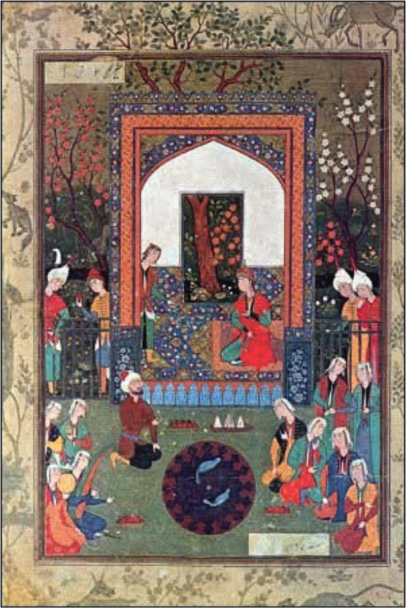
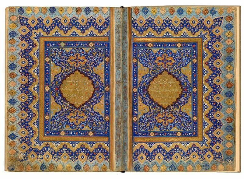
In contrast the Europeans, colour was seen as bringing them closer to the holy spirit of life, instead of luring them into the trap of superficiality. This was especially important during the time of the Ancient Egyptians and later the Islam. According to the Koran, colour plays an especially important role in one’s faith in God. The Arabic term for God, ‘musawwir’, means maker and is likewise the term used for painters. This resulted is a wealth of colour throughout every layer of society: geometric patterns adorned walls, mosaics, manuscripts, swords, tapestries, flags, books, and ceramics, all in reverence for the heavenly paradise of the Koran. The miniature paintings found in Persian manuscripts are another fantastic experience of colour and made with utmost concentration and love for pigment.